
Designing a soy sauce brand
...lost a couple thousand bucks but learned a valuable lesson
This is part of my ongoing series documenting how I’m building HEYDOH, the single-origin soy sauce company that I co-founded in the fall of 2025.
Previous posts: How we built a soy sauce company (Part 1) and (Part 2)
I knew going into HEYDOH that the most important task would be the branding, and as a writer by trade, I had a jumble of copy I wanted to play with, but no aesthetic direction.
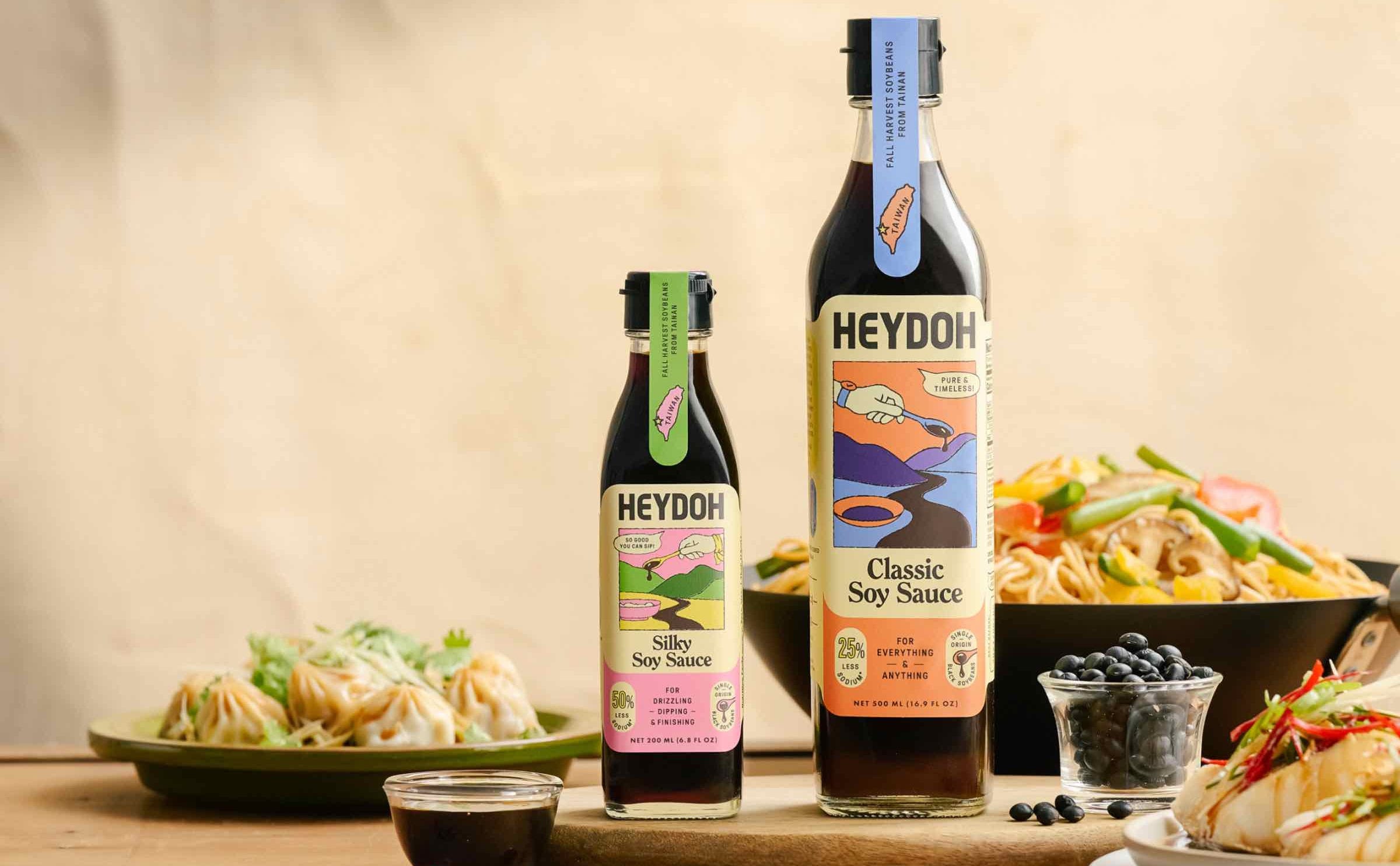
So good you can sip (which we’ve now officially trademarked, by the way). For everything and anything. For dipping, drizzling, and finishing. Less sodium* (*compared to the big guys). Twice fermented. Single-origin black soybeans.
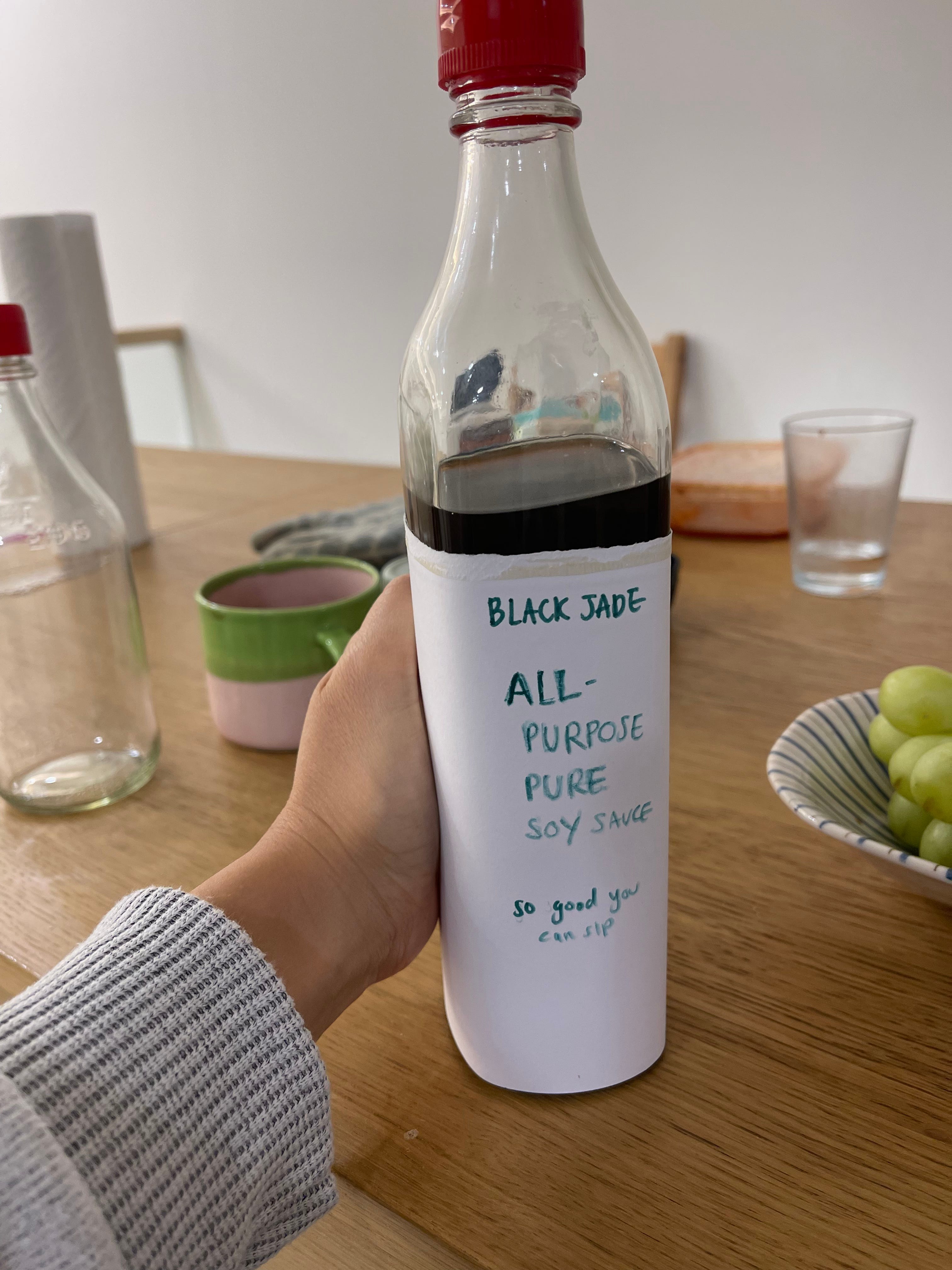
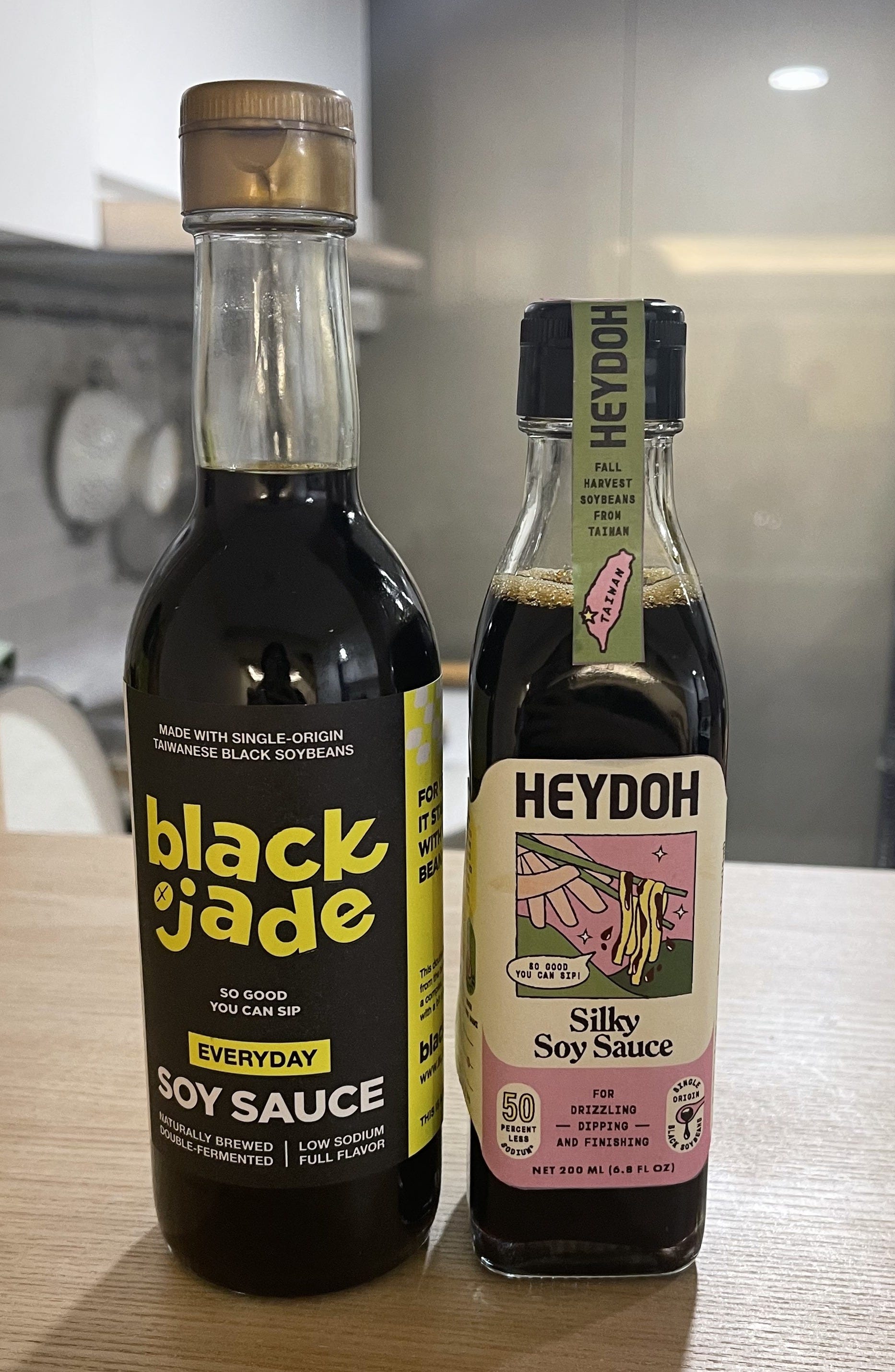
Though we had yet to formally name the brand (it was initially called Blackjade), the vision for HEYDOH was clear: a clean-label soy sauce with universal appeal, one that simplified all the various use cases for soy sauce, contained less sodium, and tasted better than anything else on the shelf.
I just needed to find someone to translate what I had written down into a label design.
So I started my search by flipping through a book of contemporary Taiwanese indie designers that I’d picked up at a neighborhood bookstore.
Though HEYDOH has always and will always be primarily for the American market, I initially sought out a Taiwanese team because of budget constraints, because I’m based in Taipei, and because I had had an incredible experience working with a Taiwanese photography team on my cookbooks. My cookbook photographers were adept at translating what I put in words into picture form. The partnership was both serendipitous and intuitive, and I thought I could easily replicate that dynamic with a local packaging designer.
Suffice to say, I was wrong.
Not because the designer we ended up hiring lacked talent. Far from it. But because we were operating from entirely different design languages. Taiwanese and American packaging styles are vastly different from one another. America veers towards bold typefaces, clear information hierarchy, punchy taglines. Taiwanese design is often more abstract, teetering on the edge of poetic.
But the biggest gap wasn’t aesthetic so much as procedural and cultural. There were mismatched expectations around iteration, communication, brand narrative, market positioning. It all lived in different cultural frameworks. I wasn’t able to vocalize what I wanted, and our designer was not familiar enough with the American market to ask the right questions to help me understand what I was looking for.
At one point, I was convinced I wanted an angsty black and highlighter yellow aesthetic.
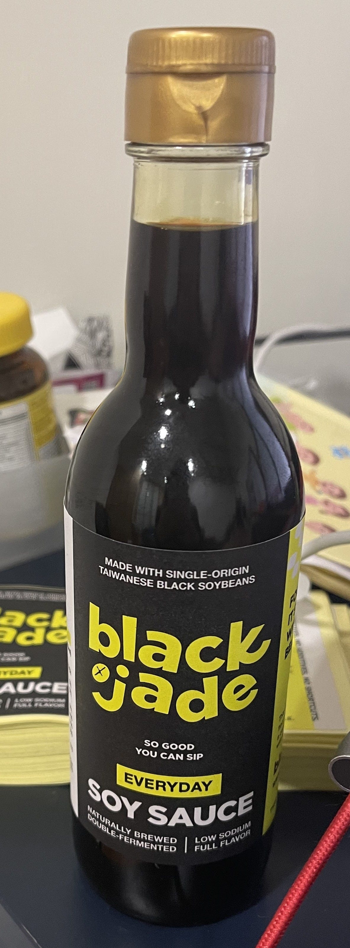
My co-founder Christine had to stage an intervention.
Many months and a couple thousand dollars later in wasted design and printing costs, we decided to bite the bullet and hire an American branding studio.
A solo Taiwanese designer might cost a few thousand dollars. A boutique American agency? Easily ten to 15 times that.
It was a painful decision and investment, but after months of unsuccessfully trying to translate our brand vision to a physical design, we found that we still (much to our own chagrin) had no idea what we wanted.
We believed that working with a specialized consumer packaged goods (CPG) design agency — especially one with experience bringing products to shelves in the States — would solve all our problems.
And thank goodness it did.
After a round of interviews with a handful of decorated agencies, we ranked our favorites by price point and how well we vibed with the account manager. We wanted a team that could push back on our bad ideas, ask us the right questions, challenge us, and ultimately lead us in a good direction. It was also important that they cared about soy sauce.
The winner: Herefor Studio, a wonderful team of three who were genuinely enthused about our products, and who approached our mental and communication roadblocks with a fine scalpel.
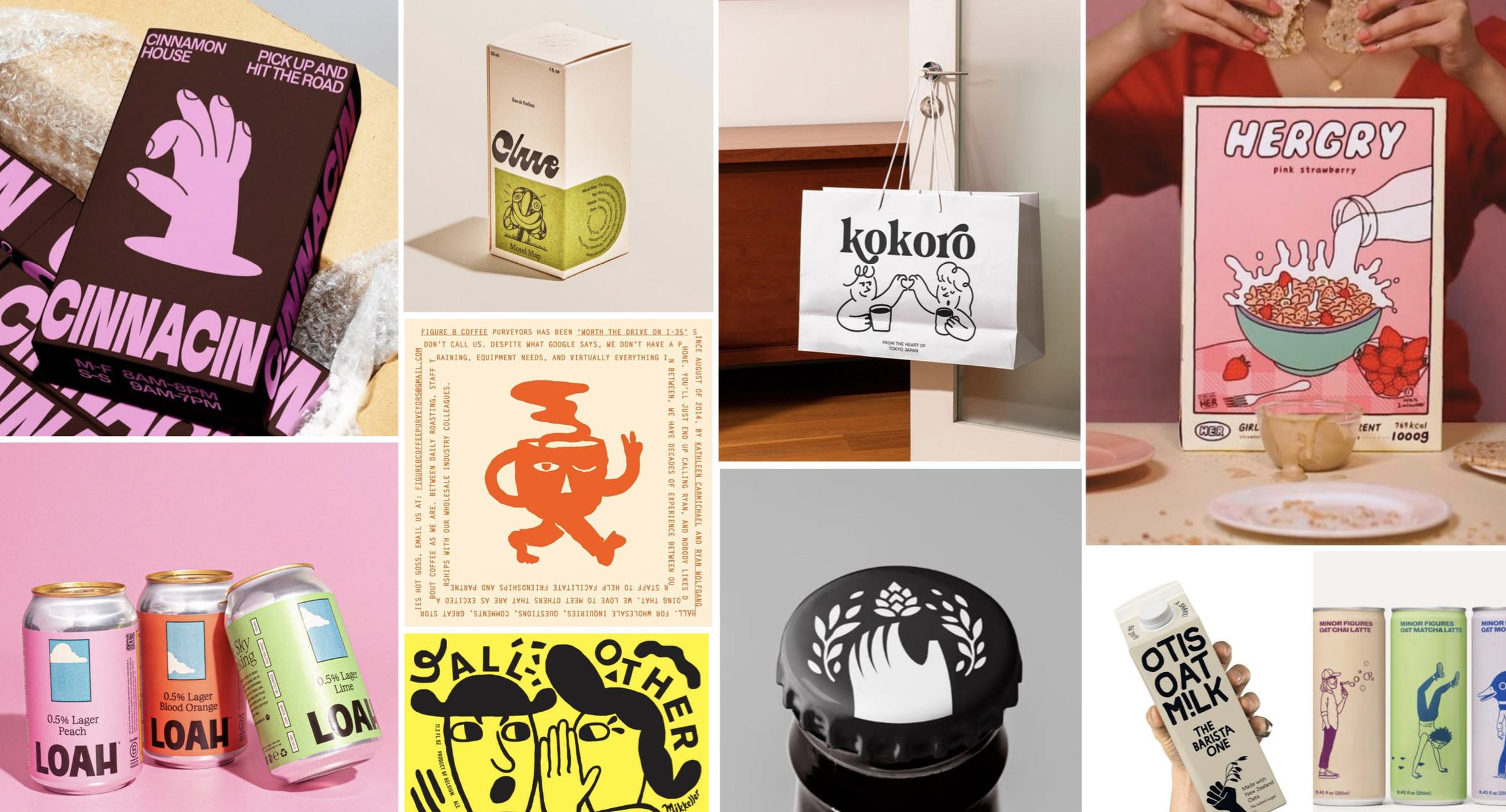
First, we were given a long survey, which helped massage out our thoughts and vision for the brand. They also ingested all the copy I had jotted down over the months and a Pinterest board of misc packaging that I liked.
Next, a round of what they called “visual territories,” in where they pitched us a collection of vibes: a series of mood boards that reflected how they interpreted the answers in our survey. This was the main step, perhaps, that was missed in Taiwan. A critical communication exercise to make sure we were all on the same page and that no wires were crossed.
After we had narrowed down our visual territories, we went straight into multiple rounds of designs. It was a couple of months of back and forth, sharpening and clarifying how we wanted HEYDOH to look.
Slowly but surely, we started to hone in on the elements:
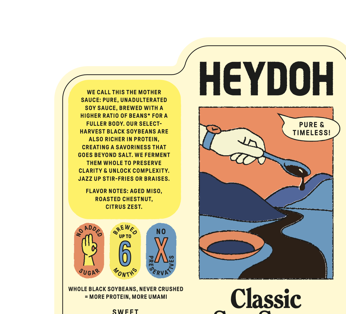
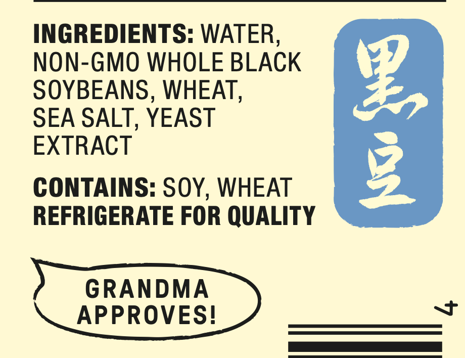
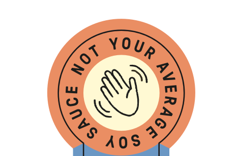
A hand: the hey in HEYDOH. The hand would wear an accessory that reflected its soy sauce variant. A classic watch for Classic Soy Sauce. A silk scarf for Silky.
A watch for Classic Soy Sauce A transportive scene that subtly evokes Taiwan and the countryside where our soybeans are grown.
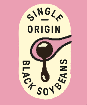
One of the inspirations that was sent over This drop element, that repeats throughout. A nod to the single-origin nature of our sauce.

A drop of soy sauce but also a reference to single-origin. A color scheme that feels calm and inviting, but intentionally avoids red. To me, red feels like the visual shorthand for Asian culture, almost in the same way red, white, and blue telegraphs “all-American.” Familiar, but clichéd.


Personality and hidden gems on the back of the pack, featuring calligraphy from Christine’s mother-in-law. Cute speech bubbles and more hands throughout.
Eventually we landed on our current labels, which we adore and are incredibly happy with.
In retrospect, although we lost money and time with our first designer, I’m grateful we did. It taught us a valuable lesson about knowing our limits. That sometimes (not always), it’s better to just call in the professionals.
Aside from designing our labels and branding system from the ground up, Herefor helped us digest and translate what we wanted HEYDOH to become. They gave structure to our instincts, pressure-tested our assumptions, and built a visual language that could scale. It was an investment that was well worth it.
We’re currently in our fifth month of business (though technically third since we were sold out for two of those months), and have acquired 95 stockists and counting. We’re moving through inventory fast and already have another production run queued up. Our social media following is slowly but steadily growing.
There’s a long way to go before we can pay ourselves and consider this a self-sustaining business.
But at least we look fabulous.
The money wasn’t lost if the lesson was learned. Your packaging is speaking your design language and it’s perfect, congratulations!
The US agency decision makes total sense. There's something you just can't replicate working remotely from the market — walking the actual grocery aisles, seeing what's on shelf, knowing instinctively what cuts through versus what disappears. That shelf literacy is really hard to get secondhand.
Loved seeing all the heart that was put into the final packaging, and congrats on 95 stockists!